200 - Volatility research
Volatility surface
Before we dive into all the indicators, it's important to go over the volatility surface - what it is and how we measure it.
What is the volatility surface?
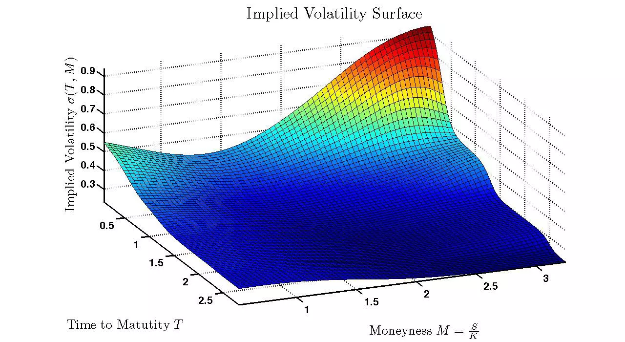
Volatility surface is the term options traders use to describe the volatility of all options across all strikes and all expirations for a single symbol. As you can imagine, this is a lot of data points, and thus is often visualized through a 3d graph, with time to maturity on the x-axis, moneyness on the y-axis, and implied volatility on the z-axis.
3d Graph

If this picture looks daunting, you’re not alone. 3d graphs are notoriously hard to interpret and understand. It’s much better to present this in a 2d graph, as shown below.
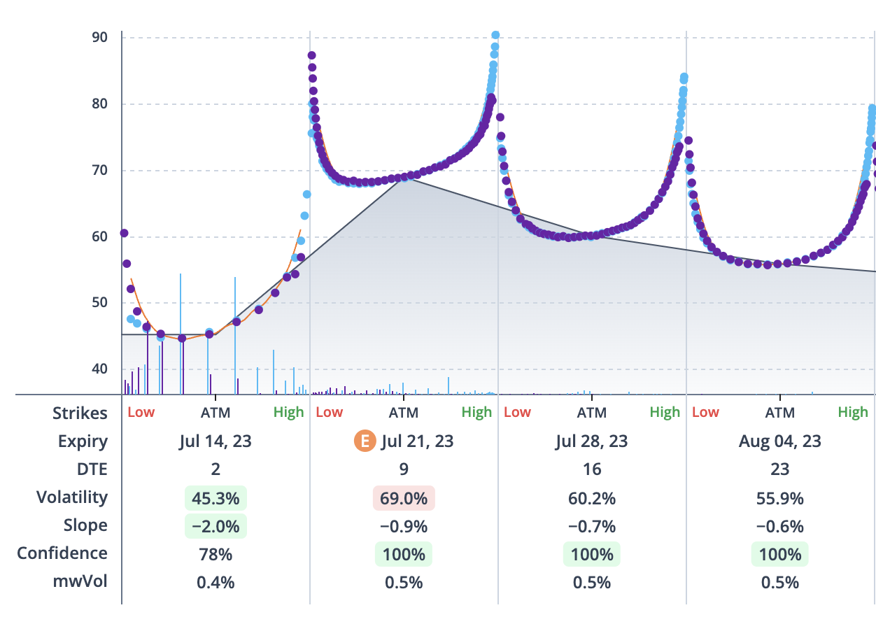
2d Graph

Do you notice the difference between the two pictures? Instead of plotting three variables onto one graph, we separate it out into a bunch of mini-graphs. In the above, you can see 4 mini-graphs, each plotting the weekly strikes on the x-axis against the implied volatility on the y-axis. This gives us a clearer view of the IV skew for each expiration, while still allowing us to view future expirations.
Term structure of IV
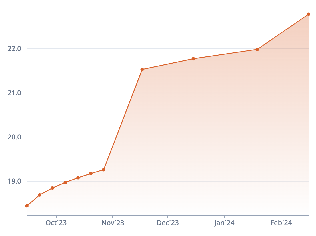
We can simplify the volatility surface by only looking at the at-the-money (50 delta) implied volatility for each expiration. This perspective of the volatility surface is called the term structure, and yields a graph that looks like the following:
Graph

Measuring term structure
We're going to analyze the term structure a lot in the coming lessons, so it's important to know how we measure it. We measure the short-term implied volatilities relative to the long-term implied volatilities. Contango is when the short-term IVs are lower than the long-term IVs, while backwardation indicates the opposite. Contango is the normal state of affairs for the options market.
The term structure is heavily effected by earnings. In the next lesson, we'll uncover why this occurs and how we create new indicators to measure this phenomenon.
Volatility skew
If the term structure describes what the volatility looks like across all expirations, then how do we describe what the volatility looks like for only one expiration? This is what options traders call volatility skew, a term you’ll hear a lot by the end of these lessons. The volatility skew describes what it looks like when we zoom in to one of the expirations in the graph above.

There are technically 3 different volatility skews presented here, so let’s go over each one. Remember that the x-axis is strikes and the y-axis is implied volatility.
The call skew
The cyan dots resemble the call implied volatility for each strike. If you were to draw a line connected all of the cyan dots, it would look like a flattened J. You might be wondering, why are the dots on the right higher than the ones on the left? This is a common phenomenon in options trading, where the out-of-the-money calls (higher strikes) have greater implied volatility than the in-the-money calls (lower strikes). This can be due to a variety of factors we described in previous lessons: hard-to-borrowness, liquidity, investor hype, etc.
The put skew
The purple dots resemble the put implied volatility for each strike. Similar to the call skew, it appears slightly lopsided, with the out-of-the-money puts (lower strikes) having greater implied volatility than the in-the-money puts (higher strikes). This is attributed to the fact that underlying equity prices tend to fall faster than they rise and options investors are willing to pay more for lower strike puts.
SMV skew
Do you see the orange line in the graph? That is the SMV curve, which we discussed in the previous lesson. Because we lined up the put and call IVs, and accounted for arbitrage, we were able to draw the true volatility skew, instead of having to pick between the call and put skews. This lays the ground for more accurate analysis of the skew.
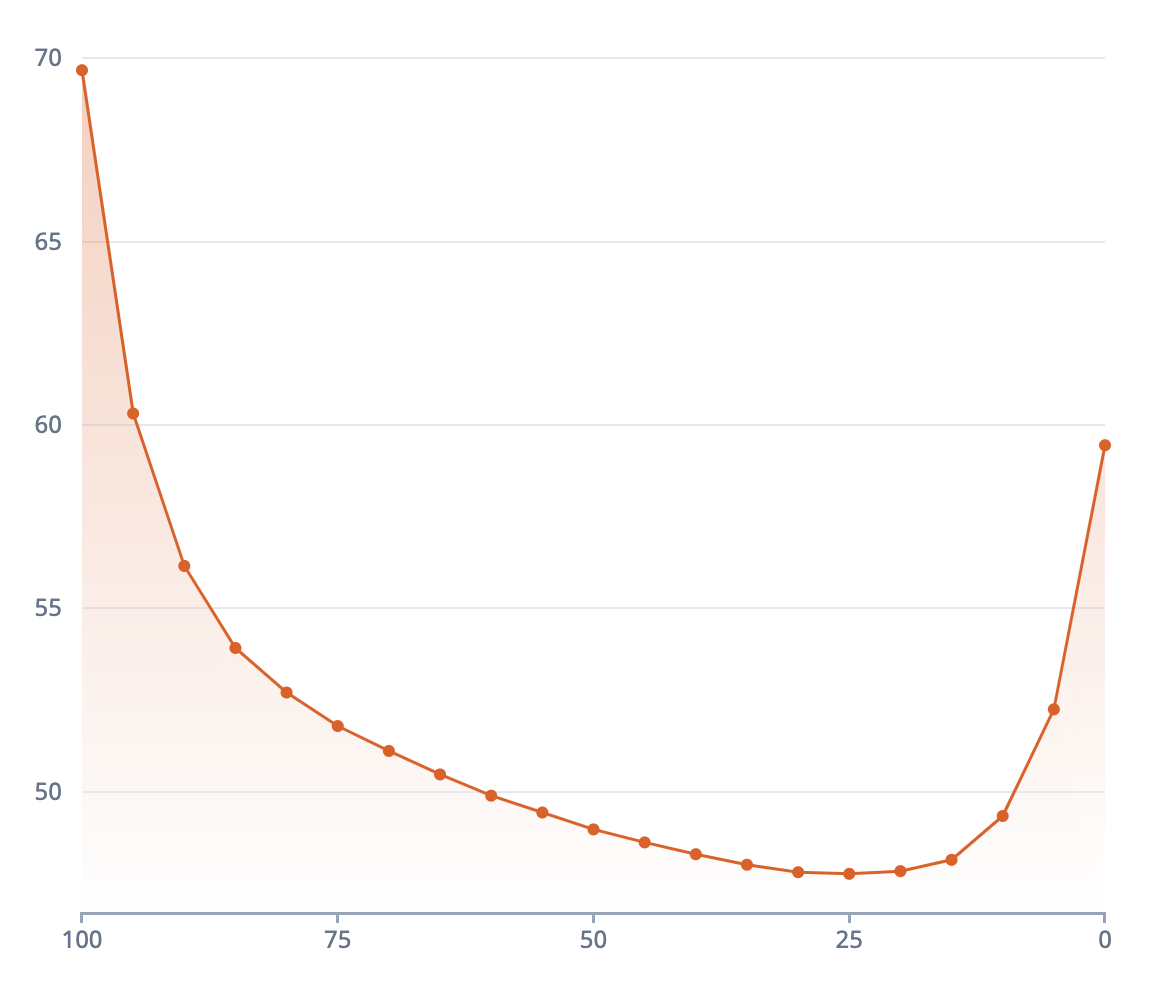
The skew often looks like a U-shaped curve that is commonly referred to as the volatility “smile.” This is because of the tendency for the at-the-money implied volatility to be lower than the further delta strikes.
The graph below shows an example SMV skew, with strike deltas (0-100) on the x-axis and implied volatility on the y-axis.

Measuring skew
The slope is the measure of the steepness of the skew, or how lopsided it is. To calculate this value, we draw a tangent line at the 50 delta, and measure the direction and magnitude of the line. In the example above, the tangent line is sloping downward, but because we drew the strikes from 100 (left) to 0 (right), we would say the skew slope is positive. This is not always the case - some skews slope negatively, others are flat.
So what’s the significance of all this? Why is it important that we analyze the contango and slope? That’s a question we’ll answer in the coming lessons.
